Half a day of length of stay is worth 26 beds
The Iris dataset is where I first learned PCA, k-means, and the three species: setosa, versicolor, virginica. Four measurements, 150 rows, and a plot that separates almost cleanly if you squint. It is probably where a lot of people first saw the idea sitting underneath machine learning, which is not really about the algorithm. You define an objective, you write down a cost, and you go looking for the parameters that make the cost smaller.
I learned that during my master’s in Brazil, in a program that taught the foundations at a level I still draw on. MATLAB was the cornerstone of the coursework, and deservedly so. It is a serious environment with decades of validated numerical work behind it, and the people teaching me had built careers on top of it. What I did not have was access. There was no university licence, and buying one personally was not a conversation I was going to have with myself at that age. I already ran Linux, so I went looking for the closest thing I could install that week and landed on GNU Octave. Same .m files, same matrix semantics, and the coursework still worked. I assumed I had left it there, filed away with the thesis. Three weeks ago I installed it again, and not out of nostalgia.
The sentence that ends the conversation
A version of the same conversation happens in healthcare every few months. Someone describes a modelling question they never got around to running. How many beds do we actually need in January. How early could we have seen that patient going bad. Then it stops, and it stops in the same two places: the licences would have to come through procurement, and the data would need an access request. Neither is a technical problem. Both are calendar problems, and months is long enough for the question to stop mattering to whoever asked it.
Both of those have a shortcut now that did not exist when I was writing thesis code, and each one is good enough for the exploratory pass where you are still deciding whether the question deserves a real project. Octave is free and runs the same language I already know. And synthetic patient data has become good enough to model on. Synthea generates complete synthetic patient histories that contain no PHI, which means an extract can sit in a public repository and you can clone it on a Tuesday afternoon. I used the same generator for the FHIR compliance skill a few weeks back, for exactly this reason.
So I built samueltauil/octave-care-analytics, which I ended up calling Care Traffic Control. Two hospital operations models in stock Octave, driven live from a GitHub Copilot canvas panel with sliders, while an agent reads the same numbers you are looking at.
This is really the second half of a pair, and the first half went the other way entirely. Back in July I built a cardiac digital twin on MATLAB and Simulink, driven from Copilot through MCP, and it is still the project I am happiest with this year. A validated closed-loop cardiovascular model of one patient, five subsystems including a baroreflex feedback loop, and an agent interrogating a live Simulink session in eight natural-language prompts rather than editing a script on disk. That model earned its licence several times over. You do not assemble solver-guaranteed physiology out of loose .m files and good intentions. What I wanted to test this time was the opposite end of the same range: no licence, no toolboxes, no data request, and a question somebody needs answered this week.
The first version answered a boring question
My first pass was a demo about Octave. It rendered a figure, the figure showed up in a canvas panel, you could change a parameter and watch it redraw. It worked by the second evening and I did not like it. It answered a question nobody is asking, which is whether Octave can draw a plot. I rebuilt the whole thing around two hospital questions and kept almost nothing from that version except the worker process.
The modelling had a false start too, and a more interesting one. Length of stay is the input everything else hangs off, and the tempting move is to fit an exponential to it. One parameter, clean, easy to explain in a slide. It also flattens the right tail, and the right tail is the entire problem. Most patients go home quickly. A small number of complex patients stay for weeks, and those are the ones who fill the ward in February. So the simulation resamples from the 1,807 real inpatient stays in the Synthea extract and rescales that empirical distribution to whatever mean you are testing. The shape stays measured. Only the mean becomes the scenario.
Why it lives in the Copilot app
The whole thing is built to run inside the GitHub Copilot app, the desktop application GitHub ships for agent-driven work. It is a separate surface from the editor extension and from the CLI. You point it at a repository or a local folder, run agent sessions against it, and handle the resulting pull request without leaving the window.
What made it the right host here is canvas extensions. A canvas is a panel the app opens next to the conversation, and the repository itself declares what goes in it. Mine is roughly 700 lines of JavaScript in .github/extensions/octave-canvas/. It starts the Octave worker, asks it for a render, and draws the sliders and the metrics strip around the figure that comes back. Because it is committed next to the models, anyone who opens this folder in the app gets the same panel, with nothing to install and no service hosted anywhere.
The rest of the repository leans on the same idea. .github/skills/octave-portability/ is a skill that knows the core-only Octave rules and the headless graphics constraints, which are genuinely hard to discover on your own. .github/agents/octave-reviewer.md is a custom agent that reviews numerics and portability and leaves formatting alone. None of that is configuration sitting on my laptop. It is versioned with the code it governs, and that is the part I would keep even if I threw out everything else.
Half a day of length of stay
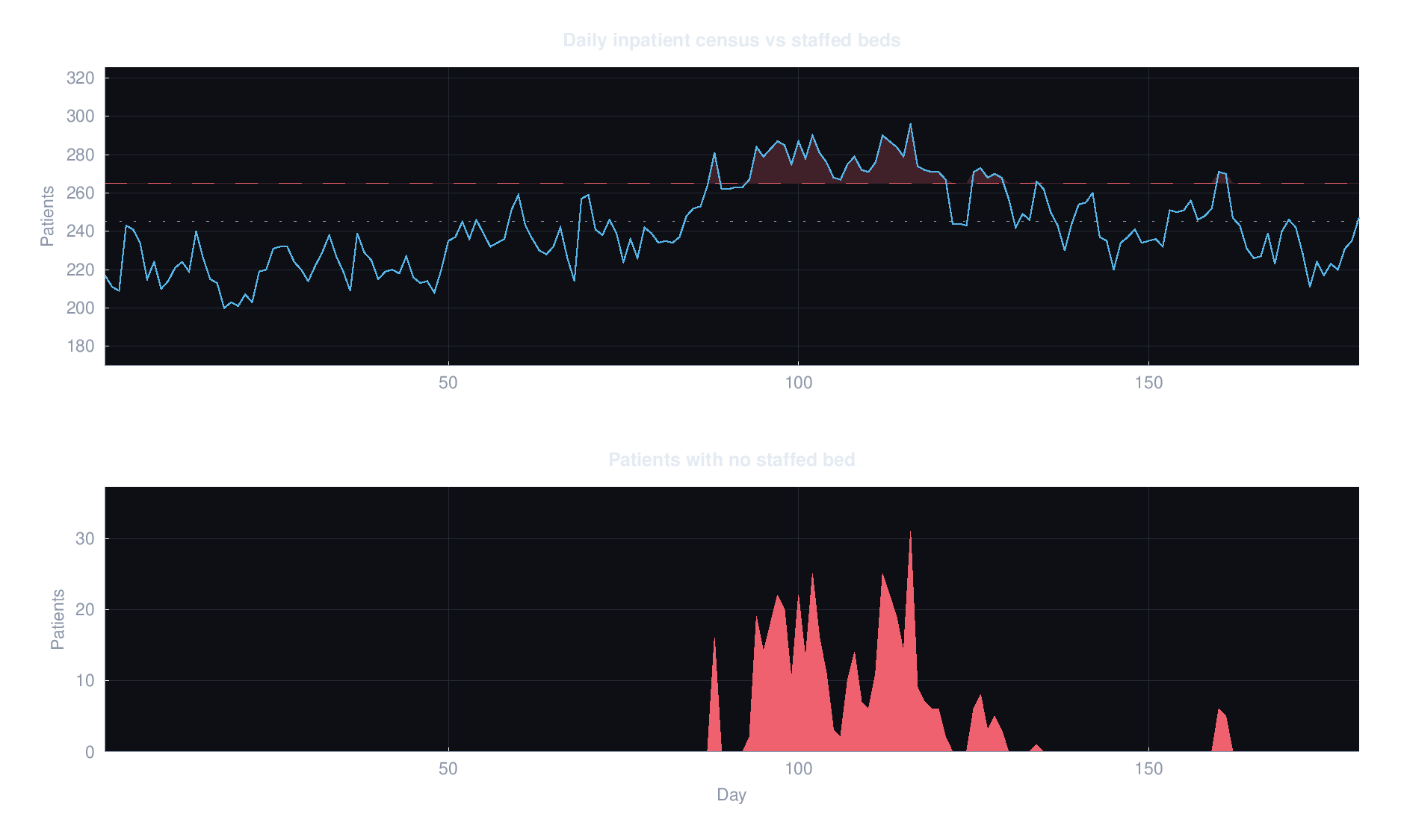
The capacity model is a day by day census with Poisson arrivals and a seasonal surge on top. The first 150 simulated days get discarded so you are looking at steady state rather than a warm-up artefact. Defaults are 265 staffed beds, 45 admissions a day, average length of stay of 4.8 days, and a 25% winter surge.
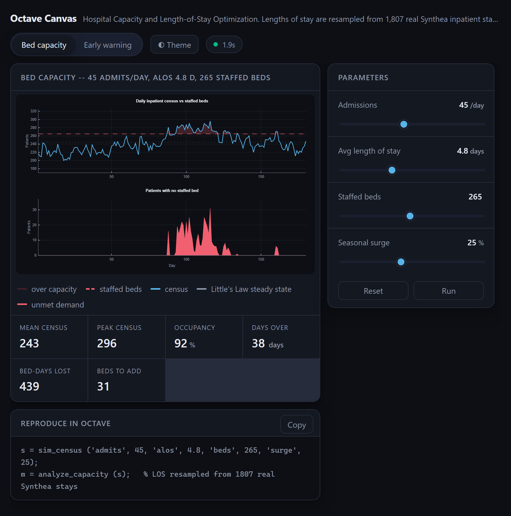
Then you drag the length of stay slider down to 4.3 and wait about a second.
| Avg length of stay | Mean census | Occupancy | Days over capacity | Bed-days lost |
|---|---|---|---|---|
| 5.4 | 273 | 103% | 97 | 2,557 |
| 4.8 | 243 | 92% | 38 | 439 |
| 4.3 | 217 | 82% | 0 | 0 |
Half a day of length of stay was worth about 26 beds and every single day of the winter overflow. Little’s Law gets you most of the way there on a napkin, because mean census is roughly admissions per day times average length of stay, so at 45 admissions a day a full day is worth about 45 beds. The simulation came in a bit above the napkin figure for the half day, since the surge does not average out politely. The direction is what matters. That is not a bed-building programme, it is a discharge-planning programme, and those are very different budget conversations.
It cuts the other way just as fast. Six-tenths of a day in the wrong direction and you are over capacity for roughly a third of the year.
The part that makes this more than a nice plot is that the panel and the agent share one state. If I drag a slider, the agent can read where I left it. When I ask it “if we cannot move length of stay, how many beds do we need to survive a 40% surge”, it calls get_model, reads the numbers currently on screen, adjusts through set_params, and answers from the run it just produced rather than estimating. That ordering is the one rule I would hand to anyone building this kind of panel. The agent has to read state before it reasons about numbers, because the human moved a slider while it was talking.
Why the moving average has to look backwards
The second scenario is 24 hours of one patient, sampled every five minutes. The resting vitals are a real row from the Synthea baseline extract of 1,456 patients. The high-frequency telemetry layered on top is simulated, because Synthea does not produce continuous monitoring data and I would rather say so than imply otherwise. A sepsis-like deterioration begins at hour 14.
Every sample gets scored with NEWS2, which is worth explaining if you have not run into it. It stands for National Early Warning Score 2, a bedside scoring table published by the Royal College of Physicians and used across the NHS and well beyond it. Each vital sign earns points based on how far outside the normal range it sits, and the points add up to one number between 0 and 20 that tells a ward how worried to be. This implementation scores respiratory rate, oxygen saturation, systolic pressure, pulse and temperature. The appeal for a simulation like this one is that the table is public, fixed and boring, so nothing about the alerting behaviour depends on a model I invented.
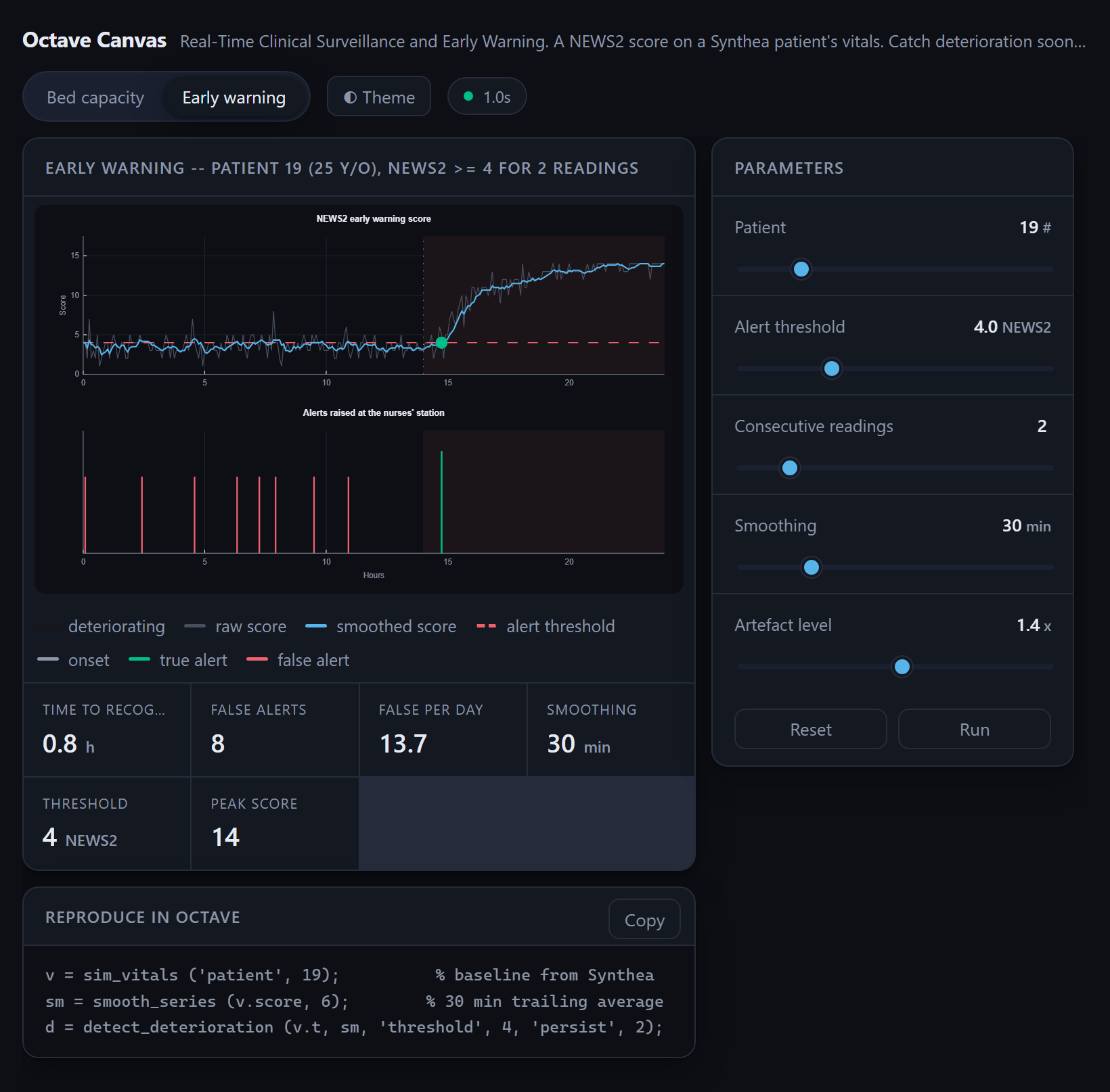
The alerting rule is a threshold plus persistence, smoothed with a moving average, and that moving average has to be trailing. Not centred. A centred window at time t averages samples from both sides of t, which means the detector is quietly reading the future. A bedside monitor cannot do that. Centre the window and your early warning system will score about as well as a system that already knows the patient deteriorated. So when a time-series model performs suspiciously well offline, the first thing I check now is which direction the window points.
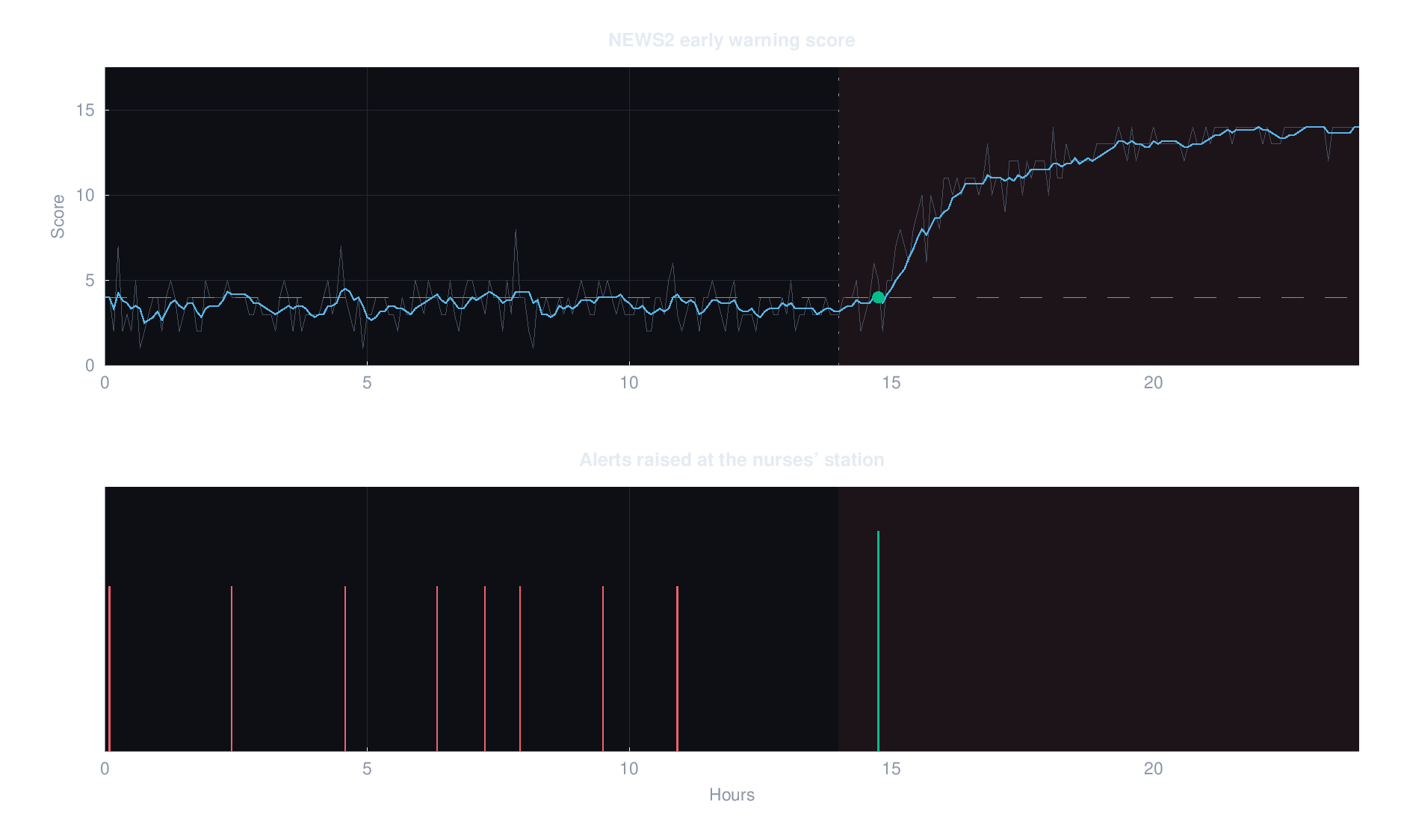
With the threshold at 4, the panel shows eight false alerts before onset and a true detection 45 minutes after. Push it to 5 and the false alerts go to zero, while time to recognition stretches to 1.17 hours. Drop it to 3, which is below this particular patient’s own resting score, and the alarm simply never clears, so it carries no information at all.
Every one of those eight red ticks is a nurse walking to a bedside for nothing. Alert fatigue is the usual reason wards stop trusting these systems, and no setting on that panel avoids the trade. Twenty-five extra minutes buys you a ward that still believes the alarm. Whether that is a good deal is a clinical judgement, not an engineering one. What the canvas does is put the price of the choice on screen instead of burying it in a default.
What the tests assert
The suite is 67 assertions and no framework, and CI is apt install octave on a stock runner. The code avoids the signal, control and statistics packages entirely, so the Poisson sampler, the NEWS2 table, the moving average and the empirical resampling are all written out by hand. That is more work than importing them, and it is the reason the whole thing installs in one line on any machine, including a locked-down hospital laptop. Both scenario figures also render headlessly on that runner and upload as build artifacts, so the run that proves the numbers is the same run that produces the pictures.
More useful than the count: the tests assert the findings, not just the plumbing. Little’s Law is checked to within 8%. The alert fatigue tradeoff is asserted in both directions, so a change that quietly destroys the argument fails the build instead of producing a prettier chart. I trust that far more than a snapshot test on an SVG.
Two details I did not expect to spend time on. The least glamorous commit in the repository installs fonts in CI, because headless Octave cannot build an axes on a bare runner and fails with ft_text_renderer: invalid bounding box, which is not an error message that tells you the container has no fonts. And the gnuplot toolkit silently drops Octave legends, so Octave renders only the data into a themed SVG and the panel draws the title, legend chips and metrics strip in HTML around it. I would love to claim that split was a clean design decision about crisp text and theming. It was about half that and half gnuplot leaving me no choice.
Here is what Octave hands over on its own, before the panel draws anything around it.
Under the panel, src/oc_serve.m is a resident worker that polls a mailbox directory for JSON requests and writes JSON responses back, which keeps the interpreter warm. A warm render takes about a second, a cold one takes four. That gap is the entire reason dragging a slider feels like using an instrument rather than kicking off a build.
git clone https://github.com/samueltauil/octave-care-analytics
cd octave-care-analytics
bash scripts/setup.sh
octave-cli --no-gui --norc --quiet examples/01_capacity_planning.m
Both scenarios run standalone from a shell, so you can read the numbers without ever opening the canvas. There is a WALKTHROUGH.md with timings if you want to demo it to someone.
Why I keep both paths open
Twenty years ago I ran Octave because it was what I could get. Three weeks ago I picked it on a laptop that could have run anything, because I wanted this repository to be something a stranger could clone and have running in five minutes. The .m code here runs on MATLAB too, with two small changes: drop the new_figure.m call that forces the gnuplot toolkit, and ignore parse_opts.m, which stands in for inputParser. Keeping that path working costs me almost nothing, and it means a team that already has MATLAB can take this into their own environment and get the toolboxes, the validation story and the support contract that Octave has never tried to offer.
I would not put this model in front of a regulator, and I would not ask Simulink to be something a stranger clones in five minutes. The cardiac twin and this one are answers to different questions, built a couple of months apart, and I would not trade either for the other. What they have in common is the interface. In both cases Copilot drives a numerical model it did not write and cannot fake, reads the state that model actually produced, and reports from that instead of estimating. Swapping Simulink for Octave changed almost everything about how the model gets built and almost nothing about how it gets driven.
What I keep circling back to is how little of the difficulty was ever technical. The math in this repository is undergraduate math. Little’s Law, Poisson arrivals, a scoring table published by a royal college, and a moving average pointed the right way. None of that was the gate. The gate was the waiting, procurement on one side and an access request on the other, and for a first pass both of those are now a git clone and a setup script. The version of me writing thesis code on Octave at two in the morning would have found that deeply unfair, and would have built something with it before breakfast.